


Spencerian and Ornamental Space:
- Mamed Babaev
- Jul 29, 2020
- 27 min read

Updated: Jan 3, 2023
Historical and Mathematical Analysis of Proportions and their Practical Application in Writing
Key words: movement, writing, angle, triangle, parallelogram, rhombus, hyperbola, function, functional analysis, algorithm, space, slant, proportion, universal optimal slant, spatial derivation, Zanerian, Spencerian.
Summary: This article studies the concept of the Spencerian and Ornamental slant and space as a basic unit of proportion from the historical, geometrical and functional points of view through fundamental mathematical analysis and derives optimal values for them, accompanied by practical applicative recommendations.
1. Introduction
Throughout millennia of human history writing served various purposes, from accounting to correspondence, from manuscript bookmaking to sacral decoration, from law codification to administration. Each era presented its own economic, technologic and aesthetic requirements to writing and scribes obliged by developing either new more easily executed hands or more ornate ones to fit the bill of the day. Thus it happened in the Carolingian Empire in the Middle Ages with introduction of the English Caroline Minuscule, in Italy in the course of the Renaissance that saw the rise of the Humanist Minuscule as well as Cancellaresca (Chancery hand) and the United States of the 19th century, reaping the benefits of the Industrial Revolution and corporate expansion, were no exception.
New hands had to be put into circulation to satisfy the demand for faster document turnover due to the rapidly growing and diversifying American economy and the need for literate and business-ready labour. Time was becoming money more than ever it had been and the prerequisites of speed of execution and legibility came to the forefront of the penman’s endeavour. Accounts had to be kept, contracts and policies written, reams of correspondence had to be sent, hundreds of thousands of young people needed educating – in other words, a very busy time for a man of letters. And at this precise moment one witnesses the advent of Father Spencer and his innovative writing system that has since been known under his own name – Spencerian. It was (and so it remains today) a comparatively easy to execute, free-flowing, lightly shaded script like no other that had come before it and through Platt Rogers Spencer’s hard work it swiftly gained foothold in many states around the country soon to become a standard.
Father Spencer is said to have based the forms of Spencerian on natural shapes to be found around the lake Erie, namely: vines, pebbles and waves and yet however romanticized a script may be, a hand is a writing system i.e. a set of elements organized by a set of structures and one of the principal structural aspects of Spencerian is its slants, namely, 52 and 30 degrees for the main and connective slant, respectively. Why were these two very specific numeric values chosen? Why is it not a different number for both slants? To answer these questions, we shall, firstly, examine this issue as it is presented in historical sources, secondly, undertake a geometrical and functional analysis of the slant and related structures from different points of view and approaches, thirdly, we shall shed light on how Spencerian affected its progeny (Ornamental Penmanship and Business Writing) and, finally, formulate practical recommendations on applying the analytical conclusions for handling these scripts “in action”.
2. Examination of Slant in Historical Sources
The Spencerian period saw a great number of publications on this writing system both in the book format and in many journals and magazines of the day. It would be a virtually impracticable feat to go through them all and, in the author’s opinion, an unnecessary one. To have a sufficient historical perspective regarding the matter, it would be opportune to chronologically analyse the teachings of the originator of Specerian Script, his disciples, namely the sons of P.R. Spencer and the other two most illustrious of his students, namely, G.A. Gaskell and A.H. Hinman (who incidentally were the second generation of American master penmen) as well as those of their commercial rivals – S. Dunton, W.M. Scribner and A.D. Knowles.
This leads us straight to “Spencerian Key to Practical Penmanship” published by the sons of Father Spencer just two years after his passing away. The section entitled “Description of Principles of Small Letters” gives us the following:
“The First Principle is simply a straight line, slanting to the right of the perpendicular, forming an angle of 52° (fifty-two degrees) with the horizontal line. This is the regular slant for all written letters.
The Second Principal is the right curve, so called because it appears in the right side of an oval figure.
The Third Principal is the left curve, so called because it appears in the left side of an oval figure.
The Second and Third Principles, when united in a lower turn, form a direct pointed oval, and when united in an upper turn, form an inverted pointed oval, both being on an angle of 34° (thirty-four degrees).” (Spencer P.R. et al. 1866, p. 43)
On the same page one finds the following graphical explanation (see Figure 1).

Figure 1 – Derivation of principles (Spencer P.R. et al. 1866, p. 43)
It is evident from the above that according to this manual the main slant is 52° and the connective slant is 34°.
The authors of this book had also this to say about the so called space:
“By one space in width, we mean a distance equal to that between the two slanting straight lines in the small letter u. In compact writing the letter u is narrower than in the ordinary open hand, but it is still the standard of measurement for the width of small letters” (Spencer P.R. et al. 1866, p. 42)
It is necessary to note that there is no strict definition of the space - as the Spencerian authors designate it - despite the fact that the connective slant has been strictly fixed to the value of 34°, doubtless, because they recognized existence of various styles of writing within the framework of the same script in which the connective slant may be modified to satisfy the requirements and/or constraints of the penman.
Seven years later came the famous “Payson, Dunton, & Scribner Manual of Penmanship” prepared by Seldom Dunton, Jesse Payson and William Scribner, all of whom were trained by the legendary master penman A.R. Dunton. This book is one of the competing publications as it is a well-known fact that for “many years … Dunton claimed that Platt Rogers Spencer had copied his style” as A.R. Dunton’s books on semi-angular writing “were published in 1848 – at least four years before P.R. Spencer published his in Ohio” (Sull 1989, p. 152).
In their manual we find the following description of the matter of our interest:
“The slant of the down-strokes should be an inclination of fifty-two degrees to the base-line. This will be found the most convenient compromise between legibility on the one hand, and rapidity of execution on the other” (Payson J. 1873, p. 45)
“A space in height is the vertical distance between the base and top line, - the height of u.
A space in width is the distance between the upper points in u. The letter u, therefore, is to be taken as the standard of measurement for a hand of any size. In a condensed or a large hand, the space in width is less than the space in height; in a running hand, equal to it, or greater.” (Payson J. 1873, p. 46)
This explanation is virtually identical to the one given by the Spencerian authors with the exception that Payson et al. do not postulate the value of the connective slant, also recognizing existence of different styles within the semi-angular script in question.
But one year later the Spencerian authors put in print “Theory of Spencerian Penmanship” which is currently used by IAMPETH for Spencerian assessment and certification. This can be said to be a more mature publication although presented in a simple-to-understand style of questions and answers. This book propounds similar ideas, fixing the main slant at 52° and the connective slant at 30° in contrast to “Spencerian Key to Practical Penmanship”. What is more interesting is the note to the question n. 41 and information regarding dimensions of the letter measuring unit:
“NOTE. Measurements are given in this system as efficient aids to the learner in securing the correct forms of letters. The most of these measurements are exact, but in instances where an exact statement would involve a minute fraction, the nearest practical measurement is given, as the safest guide.”
“42. What is the unit for measuring the height of letters?
The height of the small i, which is called a space.

43. What is the unit for measuring the width of letters?
The distance between the two straight lines in the small u, taken horizontally which is equal to three-fourths of its slanting or angular height.

NOTE. The difference between the height of i and the distance between the straight marks in u is so very little – the latter being the less by only one-nineteenth – that it is hardly perceptible in writing of ordinary size. It is, therefore, practically correct to consider the vertical space (the height of small i) as a standard for measuring both the height and the width of letters.” (Spencerian Authors, the 1874, p. 19)
It is interesting to note that in this instance the width of the space is already fixed and is roughly equal to the vertical height of the minuscule i. “Roughly” is an important word here because it is indicative of the fact that the Spencerian authors made calculations and approximated them to best fit practical writing needs.
Five years later the self-same authors published the monumental work entitled ‘New Spencerian Compendium of Penmanship’ that has forever set standards for immaculate pure Spencerian writing and whose plates were penned by the prodigious master penmen of the 19th century: Lyman P. Spencer and Henry W. Flickinger. The instructions in this book regarding the slant are more specific and structured:
“COPY 4 (Plate 3, Lesson I.) This is given more for study than for practice. Practice, however, should not be omitted. The straight line, right curve and left curve are the elements of letters. They are the material to be used in forming letters.
Observe the dotted square, with its height and width divided into three equal spaces. Carefully make such a square, then passing two and one-third spaces on upper side to the right of the left vertical, make a point; from this draw down a slanting straight line to the base of the vertical. This line will form an angle of fifty-two degrees with the base line, and is on what is called the main slant of writing.”
“STUDY THE CURVES. – See how, by the aid of the dotted squares, the connective slant of thirty degrees (one third of a right angle) is secured.” (Spencerian Authors, the 1879, p. 9)

Figure 2 – Main and connective slant (Spencerian Authors, the 1879, plate 3)
“The u-space, or the distance between the straight lines of u, is the one referred to in the statement over the copy, - that the distance between letters is one and one fourth spaces
The u-space is the unit of measure for the width of the letters and spaces between.” (Spencerian Authors, the 1879, p. 11)

Figure 3 – u-space (Spencerian Authors, the 1879, plate 3)
These instructions related to derivation of the slants and “u-space” appear to be the most specific so far and whilst the Spencerian authors do not indicate the dimensions of the “u-space”, it is fairly easy to calculate based on the slants and we shall do so in the following section of this article.
1880 saw publication of ‘Real Pen Work – Compendium of Penmanship’ by another competitor of the Spencer brothers – A.D. Knowles, manager of Detroit Fine Art Company. This book, being of a more practical nature and rather shorter, gives a very succinct explanation:
“All good penmen agree that letters look the best when slanted about 52° (fifty-two degrees) from the horizontal…” (Knowles A.D. 1880, p. 3).
One should also note the use of the word “about” which again illustrates a very practical approach to approximating small values. No dimensions of the space are given.
Just one year later the illustrious George Gaskell put into print his opus ‘Gaskell's Compendium of Forms: Educational, Social, Legal and Commercial embracing a complete self-teaching course in penmanship and bookkeeping, and aid to English composition’ which has this to say on the matter:
“… the regular slant of down-strokes and letters taken altogether (main slant), is 52 degrees, to be very exact; that of up-strokes (connecting slant) of small letters, 30.” (Gaskell G.A. 1881, p. 32)
Gaskell, being a student of Father Spencer, reiterates his precepts regarding the slants, however, the phrase “to be very exact” would imply a certain tolerance to deviations.
Three years later another renowned student of Platt R. Spencer published his course on Spencerian writing in The Penman’s Art Journal. It was none other than A.H. Hinman, legendary grand master penman of Worcester, Mass., founder of Hinman’s Business College and mentor of another legendary penman from the Golden Age – Francis B. Courtney. Unlike Gaskell, Hinman is far more technical about deriving the slants and the space:
“According to Roman Letters, from which original script or writing was derived, the general proportions of the letter are, 3 by 4 – three measures in width by four in length[1]. This proportion should, in our opinion, be recognized as the standard length and width of one space in writing. As written letters slant to the right, the correct slant may be ascertained by drawing the left and top sides of a square; then, dividing the top line into three equal parts, and draw a slanting line as in example No. 1 below.

Ex. No. 2 represents one space, or the opening between the two slanting straight lines placed three-fourths of their length apart…” (Hinman A.H. 1884, p. 1)
Hinman’s explanation sheds more light on the way penmen from the Golden Age used to determine the correct slant without using a protractor by means of a simple geometric procedure. Moreover, he discloses the historic proportion upon which the Spencerian space is based – Roman Letters. However, as it will be demonstrated in the following section of this article, his slant deviates from that of the Spencerian authors and that of his teacher – Father Spencer.
No examination of the Spencerian Script would be complete without mentioning the work of Michael R. Sull, one of the leading contemporary authorities on our subject and a master penman of IAMPETH. In his book ‘Learning to Write Spencerian Script’ he refers to ‘Spencerian Key to Practical Penmanship’ mentioned in this article with some additions of his own.
“Normally in Spencerian writing, straight lines slant to the right of the perpendicular, forming an angle of 52° (fifty-two degrees) with the horizontal lines. This is the regular slant for all written letters” (Sull, M.R. 1993, p. 15)
“In the description of letters, we shall make use of the terms one space, two spaces, etc. One space is the standard of measurement. The small letter i, without the dot, is taken for the standard in height, both for small letters and capitals. The standard height is referred to as the x-height of a letter.
One space in width is defined as the distance equal to that between the two slanting straight lines in the small letter u”. (Sull, M.R. 1993, p. 16)
M. Sull as stated above echoes the Spencerian authors recognising the main slant of 52° and not stating the exact dimensions of the u-space which is indicative of the fact that he must allow for the same variation of style by either reducing or increasing the width of the u-space.
Now that we have examined the definition of the slants and space in various historical sources, we are able to extract the essential qualities of the Spencerian space or u-space:
1. parallelism of the opposite sides;
2. inclination to the right at 52°;
3. vertical height equal to the distance from the base line to the x-height (waistline);
4. optional diagonal from the bottom left corner to the top right corner at 30° or 34°;
5. optional proportion of 3 × 4 measured along the slanting height.
Therefore, it is now possible to give the following geometric definition of the Spencerian space (or simply - space) that will be developed later on in this article:
A space is a basic unit of proportion in semi-angular writing represented by a right-leaning parallelogram whose bottom sharp angle is equal to 52° with the top and bottom sides on the x-height and base line, respectively, and with variable width proportions relative to the length of the slanting side.
It may also be worthwhile to remind the reader the definition of the parallelogram for the sake of clarity.
A parallelogram is a simple (non-self-intersecting) quadrilateral with two pairs of parallel sides.
The above definition of the space can also be summarized graphically in the Figure 4 below. The reduced red space, the medium green space and the blue extended space illustrate contraction or expansion of the space in case of a narrower (large hand) or broader (running hand) style of Spencerian writing.

Figure 4 – Basic Spencerian space illustrating essential qualities
3. Geometrical Analysis of Different Spencerian Space Types
Based on the essential qualities and the definition that we have derived from them, it is easy to conclude that the space needs specifying in strict terms. To do so, we shall make use of basic trigonometric models and functional analysis that will allow us to calculate either proportions of a space based on its angles or its angles by the instrumentality of its proportions.
In order to provide a clear and easy-to-follow explanation, we shall agree to use the following mathematical notation:
∆ - means a triangle, e.g. ∆ABC which is read as “triangle ABC”.
∠ - means an angle, e.g. ∠ABC is an angle with the vertex at B.
∟ - means a right angle that is to say an angle of 90°, e.g. ∟ABC is a right angle with the vertex at B.
Please, note that in the course of calculations, all the figures were rounded to one hundredths (two digits after the dot, i.e. 0.00).
3.1. Basic Spencerian Space
Figure 5 shows a basic Spencerian space having the main slant equal to 52° and the connective slant – to 30°. We shall also agree that the vertical distance from the base line to the x-height is equal to 1 relative unit. In other words 1 can be one millimetre, one centimetre, one inch, one decimetre, one meter etc. As is stated above, now that we know the angles of the space, we shall calculate its proportions.

Figure 5 – Basic Spencerian space
As ∟CBO is a right angle, it is easy to find ∠CBA given that ∠ABO is 52°.
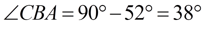
Since ∠ABO = 52°, it logically follows that ∠CAB = 52°.

Let us now find the line segment AB.

Now let us find the length of the line segment CA.

We need to find the length of the line segment AD which constitutes the top side of the space. To do so we need to subtract CA from CD but we do not know CD.

Let us consider ∆BCD. Since ∠CDB is equal 30° then BD (hypotenuse of ∆BCD) is twice the length of CB (cathetus opposite an angle of 30°) and is equal to 2 (relative units).

Now we can calculate the value of the line segment CD. We shall use the Pythagorean Theorem which states that the square of the length of the hypotenuse of a right triangle is equal to the sum of the squares of the lengths of the other sides:

We have calculated the value of CD and can now find the length of AD – the length of the top and bottom side of the space:

It becomes obvious that CB is virtually identical to AD considering the fact that Spencerian was usually written at 3 mm x-height the difference of 0.05 relatives units becomes insignificant.
Now let us calculate the proportion of the basic Spencerian space:


Hence the proportion of the BASIC SPENCERIAN SPACE is 3 ⨯4 along the main slant of 52°. It now becomes clear that this slant was not chosen at random but rather it was calculated to accommodate said proportion – the proportion of the Roman Letters which are mentioned in the lessons by A.H. Hinman, a student Father Spencer which leads us to Hinmanian Penmanship and its space.
3.2. Hinmanian Space
The reader is referred to the relevant description in the first section of this article. A more specific diagram of the Hinmanian space can be seen in Figure 6.

Figure 6 – Hinmanian space
According to Hinman, it is necessary to draw the left and top side of a square, divide the left side into 3 equal parts and mark a length segment equal to 2 parts of this division on the top side (see Figure 6 – yellow notch marks) then one has to connect the bottom of the left side to the extremity of the 2-part long segment on the top side. This produces the Hinmanian main slant.
To build the Hinmanian space, one has to divide the line sitting on the main slant into 4 equal parts and then mark a length segment equal to 3 said parts from the top point of this line along the x-height (see Figure 6 – black notch marks).
This method provides a very simple way to establish a space without the need to recur to a protractor. However, it leaves the values of the main slant and that of the connective slant unclear. We shall now calculate these values.
First we need to calculate the length of AB which can be done by means of the Pythagorean Theorem.

Now we are able to calculate the value of ∠CBA which is designated as β in Figure 6.


Hence ∠CBA = 34.06°.
The Hinmanian main slant is calculated as follows.

What remains is to find the connective slant - ∠DBO.
It is obvious that:

I follows that:

We know that AD is equal to three fourths of AB which makes it possible to find the value of AD.

Hence:

Now let us consider ∆BDP.


Knowing the lengths of all the sides of ∆BDP, it is easy to find ∠DBP designated as β1 in Figure 6.


Thus the Hinmanian connective slant is equal to:

We can see that there is a difference of 3.94° between the Spencerian main slant and the Hinmanian one which shows that even this value is not sacrosanct and may easily be modified when and if needed. Indeed, in his letter to L.M. Kelchner (a Zanerian founder), A.H. Hinman writes the following to corroborate this statement.
“Worcester Jan. 21, 1884
L.M. Kelchner
Dear Sir,
I am an Eclectic – see Jan. Art Journal[2]. I recognize that a space should be 3⨯4 as explained in my lesson. Beyond that my notions are quite liberal. This is a specimen of my average writing.
Yours truly,
A.H. Hinman” (Sull, M.R. 1989, p. 408)
On a side note, considering the value of the Hinmanian main slant, his method of establishing it may be used for Engrosser’s script whose slant should be equal to 55°.
Having considered two differing approaches to derivation of the space: the first based on angles, the other – on proportions, one is left wondering whether these two derivative methods could be somehow combined. We shall now undertake such an attempt and call such space – Ideal Spencerian. 3.3. Ideal Spencerian Space

Figure 7 – Ideal Spencerian space
The vertical height (i.e. the vertical distance between the base line and the x-height) and the top side of the space are equal and for the purposes of our proportional calculations they are 1 relative unit. The top side of the space is related to its slanting height (length of the lateral sides of the space) as ¾. In strict terms it is as follows.


The main question here is at what main and connective slant these proportions are observed. In other words we need to find ∠ABO and ∠DBO.

It is obvious that:

Hence:


Therefore, given our assumed constraints, the Ideal Spencerian main slant should be equal to 48.59°.
Now let us calculate the value of the connective slant i.e. ∠DBO.


We are now able to calculate ∠ABD which marked as β in Figure 7. To do so, we shall use the Law of Sines.

Based on the value of sinβ, we can calculate the value of ∠ABD.

We are now able to calculate ∠DBO.

We have found the value of the Ideal Spencerian connective slant. Notice also how close the Ideal Spencerian main slant is to 50° - an angular value adopted by the Zanerians which leads us to the Zanerian Ornamental Penmanship.
4. Zanerian Ornamental Penmanship and its spatial proportions
By the late 1800’s, Spencerian started giving way to more rapidly executed hands striving for greater legibility. One saw rise and decline of vertical writing and short hand which were on the extremities of the legibility/speed spectrum and eventually penmen started modifying what was already available – Spencerian writing – through eliminating its elements that impeded speed without detriment to its legibility. This endeavor resulted in advent of Business Writing and Ornamental Penmanship. However, the issue of the (main/connective) slant remained no less topical than in the course of the Spencerian period.
4.1. Legibility, Speed and Universal Optimal Main Slant
What is the role of slant in writing? What slant was to be chosen to insure the most efficient combination of rapidity and legibility? What were the principles underlying this choice? These questions are answered in the lecture delivered on 24 November 1908 by Charles Paxton Zaner, a founder of the Zanerian College and the Editor of the Business Educator.
“Slant, Rapidity and Legibility
Vertical writing came, was not equal to commercial demands, impressed legibility and has passed out of use. We learned from it and are better for its coming. The two essentials to good writing are 1) Legibility and 2) Rapidity.
Let us see how slant contributes or detracts from these two essentials. There is no doubt but that the print form is the most legible, because it has shaded vertical lines and no connective lines to confuse, all down strokes being on the one (main) slant. Italic however is more quickly produced with the pen than heavy shaded print forms. Round hand is still quicker of execution; Vertical writing more rapid still, and our modern business style is most rapid of any. A more slanting hand would be more rapid still if the demand of Legibility did not restrain such a style. Each style it will be noted gave way to a more rapid variety and at the same time sacrificed some legibility for the sake of attaining greater speed.

The above illustrates the evolution, omitting the vertical. The vertical line is the one that makes for legibility and the more slant the less legible, see illustration:

We to-day have a hand that combines legibility and speed and if either factor is to be given more consideration it must always be at the expense of the other. Each has had to concede to the demands of the other.
Letter n vertically written has up stroke slant of 45° and down stroke slant of 90° and considering that strokes made in the same direction are made more rapidly than those changing direction, we can see why vertical is slower of execution than slant writing

In our present style of semi-slant the n up stroke slants 45° down stroke 22 ½° [3].
The difference in direction of line between present style and vertical in slant is only half as great and hence is more rapidly executed. The Spencerian meant half angular 52 ½° and the result of teaching it was that pupils wrote too angular a hand. Turns and angles are the essentials of legibility and to maintain this we must strike a golden mien. A slant of 60° to 70° is safe for Business Writing. Public schools 1st grade 70°, 4th grade 65°, 8th grade 60°. For slow writing vertical is the best but it is script drawing rather than writing. Do not contend that slant is a main factor but a minor detail.
Variety of turns and angles lead to illegibility. Letters have their physiogonomy – learn their faces, and at times compare script with its ancestral print forms.” (Endress, A.B. 1908, p. 21-23)
It is clear that Zaner forges a connection between legibility and rapidity in other words their relation can be presented as a function. If we agree that legibility is the core characteristic of script, then it is logical to make it the output (dependent variable) and to designate speed as the argument (independent variable).

where
· L is legibility
· S is speed of writing
Since the greater is legibility, the lower is speed and, vice versa, the lower is speed, the greater will legibility be, the functional nature of this relation is inverse proportionality.
Formally, two variables are inversely proportional if each of the variables is directly proportional to the multiplicative inverse (reciprocal) of the other, or equivalently if their product is a constant. It follows that the variable L is inversely proportional to the variable S if there exists a non-zero constant k such that:

or equivalently, L×S = k. Hence the constant is the product of L and S.
The graph of two variables varying inversely on the Cartesian coordinate plane is a rectangular hyperbola which is symmetrical relative to the bisector of the angle between the coordinate axes (see figure 8).

Figure 8 – Graph of inverse proportionality (hyperbola)
This kind of symmetry (applicable to any hyperbola) means that S and L are equal at the point where the bisector and the hyperbola intersect. In other words

e.g.

It would be advisable to consider only the positive values (positive branch of the hyperbola) because negative legibility and speed do not exist in penmanship. In other words the point where S is equal to L is in the middle of the hyperbola graph. This has far reaching consequences in terms of the optimal main slant.
We know that according to Zaner the vertical line is associated with maximum legibility whereas the horizontal line represents maximum speed. The angle between these lines is a right angle equal to 90°. We also know, owing to the hyperbolic symmetry described above, that in order to reach the equality between L and S we need to divide this angle by 2. Hence the Universal Optimal Main Slant is equal to 45°. In this case the term “optimal” means a slant value (and the corresponding point on the graph) that provides a balance between writing speed and legibility i.e. a point where these two values are equal.
The value of the Universal Optimal Main Slant is important because in terms of the balance between speed and legibility it is applicable to all the semi-angular scripts, be it Spencerian Script, Ornamental Penmanship, Business Writing or Engrosser’s Script et al. with the only difference in the proportion of the space (Spencerian 3*4, Engrosser’s 1*2 etc.). This would also explain why so many penmen gravitated to this main slant, the most notable among them being Louis Madarasz.
This is further corroborated by what Zaner said in the course of his lecture cited above and his instructions in the Lessons in Ornamental Penmanship.
“… With the arm and paper in position as described, little finger resting – gliding on blotter – you may place the pen one-tenth of an inch above the line of the paper and draw it to the line at an angle of about 50 degrees (or any similar angle that you may adopt for your penmanship)…” (Zaner C.P. 1920, p. 14 – underlined by the author).
4.2. Standard Zanerian Ornamental Space and Universal Optimal Ornamental Space
In the self-same book, C.P. Zaner wrote the following regarding slant:
“… the down strokes are on a slant of 50 degrees, while the up strokes are on a slant of 25 degrees. The spaces are the same in width as in height.” (Zaner C.P. 1920, p. 4)
This means that the Standard Zanerian Ornamental Space is more easily derived than any of the Spencerian spaces introduced above in so far as in this case one deals with a rhombus i.e. a quadrilateral whose four sides all have the same length with the acute angle of 50 degrees (see Figure 9) this means that the connective slant is equal to 25° as the main slant needs dividing by two.

Figure 9 - Standard Zanerian Ornamental Space
However, in light of the findings described in the previous section – calculation of the Universal Optimal Main Slant – we may transform the Standard Zanerian Ornamental Space into the Universal Optimal Ornamental Space by modifying the value of the acute angle to 45°. To calculate the connective slant of this new space, it is necessary to divide 45° by two since we deal with a rhombus. Thus the connective slant is at 22.5° (see Figure 10).

Figure 10 - Universal Optimal Ornamental Space
It becomes apparent that Ornamental Penmanship is as susceptible of making use of different spatial dimensions as is Spencerian Script. This is further developed by Clinton C. Canan.
“Among the writers of ten and twenty years ago and of the present time, there is a great diversity in the style of the leader’s artistic writing. These styles can be divided into three classes, namely: the small, round, heavily shaded style as written by L. Madarasz, F.B. Courtney and others; the larger, accurate, fine-lined style of which the late A.D. Taylor was the unequaled advocate; the medium size, angular, accurate writing of E.W. Bloser, L.M. Kelchner and others. The first style has speed and dash, the second and third accuracy, and all have grace and beauty. The first shows to advantage in card writing, the others in page writing.
These classes of writing cannot be compared to advantage, and the writing that appears best to one person is sure to be another’s second choice. These styles have their many admirers, but it is not generally conceded that any one style is best.” (Zaner and Bloser Company, the 1921, p. 5).
We may reformulate Canan’s words, considering the various spaces that we calculated so far. A.D. Taylor was inclined to use the Basic Spencerian Space for his Ornamental Penmanship, meanwhile L. Madarasz and F.B. Courtney both favoured the Universal Optimal Ornamental Space sometimes extending it, as to C.P. Zaner and E.W. Bloser, they tended to employ their own Standard Zanerian Space.
5. Practical writing recommendations
Understanding the structure of the space in general and its specific modifications that were illustrated in the previous sections plays, as the author believes, a crucial role in producing smooth and graceful writing in the most efficient manner possible thanks to a simple Dynamic Mental Geometrical Mapping technique which we shall examine here.
To do so we shall consider two examples which will demonstrate how the above technique may be used in day-to-day penmanship: Hinmanian Space owing to simplicity of its derivation as compared to the Basic Spencerian Space as well as Standard Zanerian Space due to its canonical nature. However, the self-same algorithms will be applicable to the other space variations.
5.1. Application of Dynamic Mental Geometrical Mapping to Spencerian Script
In many of his books C.P. Zaner speaks about the importance of perception and performance in fine penmanship echoing the teachings of Father Spencer: “The hand cannot well perform that which the mind does not perceive” (Zaner C.P. 1920, p. 4). Thus now we shall make a transition from perception/form to performance/movement, putting theory into practice. Figure 11 exemplifies an algorithm (set of steps) aimed at achieving uniform spacing throughout the entirety of a body of writing. As long as the penman is aware of the spatial proportions of the selected script, it is fairly easy to follow.

Figure 11 - Dynamic Mental Geometrical Mapping for Spencerian script
We shall now consider it step by step:
Step 1: Divide the main slant by 4;
Step 2: Make an imaginary horizontal line ¼ of the slanting height from the base line;
Step 3: Rotate ¾ of the slanting height around the vertex of the upper obtuse angle of the space and stop rotation once you reach the x-height;
Step 4: Connect the vertex of the lower acute angle of the space with its upper acute angle either with a right or left curve, depending on the letter form;
Step 5: Descend down the main slant;
Step 6: Restart from Step 1.
5.2. Application of Dynamic Mental Geometrical Mapping to Ornamental Penmanship
The mapping procedure becomes simpler as is evident in Figure 12 in case of Ornamental Penmanship as its space is a rhombus and we can eschew dividing the main slant altogether.

Figure 12 - Dynamic Mental Geometrical Mapping for Ornamental Penmanship
Follow these steps:
Step 1: Rotate 1 slanting height around the vertex of the upper obtuse angle of the space and stop rotation once you reach the x-height;
Step 2: Connect the vertex of the lower acute angle of the space with its upper acute angle either with a right or left curve, depending on the letter form;
Step 3: Descend down the main slant;
Step 4: Restart from Step 1.
The reader will find that after even a small amount of practice, dynamically mapped writing becomes a second nature. Once a specific space is chosen, it is fairly easy to adhere to it by following the above steps.
6. Conclusion
In this article we have calculated the proportions and angles of various Spenecerian as well as Ornamental units of proportion (spaces) and by virtue of functional analysis mathematically derived the value of the Universal Optimal Main Slant and the relevant spaces.
We have calculated the proportion of the Basic Spencerian Space as prescribed by Father Spencer and the Spencerian Authors and have shown that it can be flexibly modified according to the penman’s needs within certain tolerances. We also calculated the main and connective slant of Hinmanian Penmanship – a historic successor to the Spencerian method. This allowed us to combine said two approaches and to mathematically derive the Ideal Spencerian Space.
Moreover, we have established a functional dependence between legibility and writing speed and specified the nature of this function – inverse proportionality, which in its turn made it possible to postulate the concept of the Universal Optimal Main Slant applicable to all the semi-angular scripts, be it Spencerian Script, Ornamental Penmanship, Business Writing or Engrosser’s Script with the only difference in the proportions of the space.
Additionally, we calculated the proportions of the Standard Zanerian Ornamental Space and introduced the concept of the Universal Optimal Ornamental Space.
In light of the above findings, it may be possible to conclusively close the long-standing debate about the proportions of the American semi-angular scripts and to provide useful easy-to-follow practical writing recommendations in the form of Dynamic Mental Geometrical Mapping that allow for proportional uniform (well-spaced) movement writing.
To the best knowledge of the author, no similar study has ever been undertaken and the findings as well as research methods of this article stand fundamentally unique among all the works on this subject matter.
We have examined the tradition of the great Master Penmen of the past whose skill set the standards by which – according to IAMPETH - all future penman would be judged and standing on the shoulders of Giants, we have endeavored to see further by introducing new fundamental concepts but will it be sufficient for the new generation of penmen to equal or to surpass their achievements?
List of references
Books:
Endress, A.B. 1908, ‘Pensmanship lessons, ‘Lectures by C.P. Zaner and other items of Instruction and Information Gathered at the Zanerian College’, hand written notes taken at the Zanerian College, Columbus
Gaskell G.A. 1881, ‘Gaskell's Compendium of Forms: Educational, Social, Legal and Commercial embracing a complete self-teaching course in penmanship and bookkeeping, and aid to English composition’, Richard S. Peale, St. Louis
Knowles, A.D. 1880, ‘Real Pen Work – Compendium of Penmanship’, Detroit Fine Art Company, Detroit
Payson, J.W; Dunton, S.; Scribner, W. M.; Shattuck, G. H.; Manson, A.S. 1873, ‘The Payson, Dunton, & Scribner Manual of Penmanship’, Woolworth, Ainsworth, & Co., New York
Spencer P.R.; Spencer R.C.; Spencer H.C.; Spencer L.P.; Spencer P.R. Jr.; Spencer H.A.; Hayes M.D.L. 1866, ‘Spencerian Key to Practical Penmanship’, Ivison, Phinney, Blakeman, New York
Spencerian Authors, the 1874, ‘Theory of Spencerian Penmanship’, Ivison, Blakeman, Taylor & Co., New York
Spencerian Authors, the 1879, ‘New Spencerian Compendium of Penmanship’, Ivison, Blakeman & Co., New York
Sull, M.R. 1989, ‘Spencerian Script and Ornamental Penmanship’, vol. 1, LDG Publishing, Prairie Village
Sull, M.R. 1993, ‘Learning to Write Spencerian Script’, LDG Publishing, Prairie Village
Zaner C.P. 1920, ‘Lessons in Ornamental Penmanship’, Zaner & Bloser Co., Columbus
Zaner and Bloser Company, the 1921, ‘C.C. Canan – Collection of Penmanship’, Zaner & Bloser Co., Columbus
Periodicals:
Hinman A.H. 1884, ‘Lessons in Practical Writing’, Penman’s Art Journal, vol. 8, no. 1, p. 1
All rights reserved©. No part of this article may be reproduced in any way and/or by any means without an express written permission from the author.
[1] Here A.H. Hinman is speaking about the slanting length i.e. length as measured along the down-stroke on the main slant as is evident from his diagramme. [2] Here Hinman means the ‘Penman’s Art Journal’ which he and his friend D. Ames used to run together. [3] This is clearly either a lapsus linguae on the part of the lecturer or a lapsus calami made by Mr. Endress because it is impossible to write with such slants, unless one is writing backwards. Hence the writing clearly means: “In our present style of semi-slant the n up stroke slants 22 ½°down stroke 45°”.
About the Author
Mamed Babaev
Member of the International Association of Master Penmen, Engrossers and Teachers of Handwriting (IAMPETH)
Instagram: @ddb107
Calligraphy has accompanied Western civilization for as long as it existed. In fact, aforetime being civilized meant being able to put one's thoughts neatly and concisely on paper, giving rise to the arts of manuscript and later on penmanship that is said to have reached its zenith in the late 19th early 20th century through the agency of the legendary master penmen whose works constitute one of the pinnacles of the civilized world. It is this role of the flammifer of what being human stands for that inspired me to pursue this fascinating art form. My studies are an endeavour to reconcile the dichotomy of penmanship that is largely perceived as an art of the past but also that embodies one of the foundations of the future of our civilization as a whole.
This undertaking may well be said to have been a lengthy one as I have been studying and practicing calligraphy for eight years now. I started my calligraphic journey with broad-edged calligraphy, illumination and manuscript making, transitioning but a year ago to pointed pen work and traditional American penmanship from the Golden Age (namely Engrosser's Script, Hinmanian and Duntonian penmanship as well as flourishing, following in the footsteps of Messrs. Brown and Williams and leaving Charles Zaner, Earl Lupfer, William Dennis and others for a later stage).
Moreover, like Francis B. Courtney, I am an accountant - among other things - and have no formal art training. I am mostly self-taught in the areas of calligraphy and penmanship. In my broad-edged days, I have studied works of numerous authors both contemporary and historic on calligraphy and paleography (David Harris, Eleanor Winters, Bernhard Bischoff, Raymond Clemens, Timothy Graham, Edward Johnston, Sir Edward Thompson etc.).
On the other hand, speaking of my pointed pen work, I find that the old journals (Penman's Art Journal, Western/American Penman, The Educator etc.) as well as the books of the Zanerian College and Spencer brothers provide a cornucopia of invaluable information that has played a major part in my studies both in terms of theoretical analysis and developing my artistic skills as a penman.
In addition, the persons that either helped and/or influenced me most include Mr. Paul Antonio, Dr. Joseph Vitolo, Mr. John DeCollibus and Mr. Jacob Weidmann whose in-depth advice, research and masterly practices, though diverse in nature, have been a true conductor of light for honing my penmanship skills.
For instance, in recent years I have been holding calligraphic workshops both in broad-edged calligraphy and pointed pen work upon requests from my friends both at home and abroad, the last one being in Singapore .
However, man does not live by penmanship alone and I do have other related interests which include: academic and technical drawing, watercolor and acrylic painting, ink making, wood carving and pen design, mathematics, finance and statesmanship.
Albeit it could be argued that penmanship may not be at the forefront of graphical design as it used to be not so long ago, it incarnates humanity itself through its various practices, applications and its sheer historic role for the advancement of the human race, inspiring many to pursue it. Therefore, my goal is to achieve a mastery of this art that would rival or maybe surpass the grand old master of Worcester. And yet, is it practicable? … Time will tell.
Comments